Website Re-design
Columbia Association Website: identified current design issues, generated mood boards and a design strategy, and finally created a high-fidelity Figma prototype.
Current Website
The Columbia Association aims to support the community of Columbia, Maryland. The website is a central hub for everything happening in Columbia. On the website, users can find information about all Columbia’s facilities, sign up for a gym membership, view community events, browse and sign up for children’s camps, fitness classes, etc.


Problem
Through usability testing conducted previously, I was able to identify the main problems that the website had. Problems included:
A large volume of information around any specific topic is scattered throughout the website. This ultimately lead to the website being very disorganized. Users often have to scroll down several website pages to find the relevant information.
The ‘Events’ page was very outdated. The website wasn’t organized and without filtering options made navigating the site very inefficient and frustrating for users.
The overall color scheme of the website is dull and boring but as a government website it served its purpose. In addition, the color scheme is not consistent across pages and doesn’t have much purpose.
Design Strategy
Following the identification of the problems, I put together my design strategy. First, I wanted to address the volume of text scattered around the website. My goal was to only include information that was relevant and make it easier for the user to find the information they needed within 30 seconds of searching. I also aimed to find a way to organize the relevant information so that it wasn’t overwhelming or distracting. This would declutter the main pages and remove excess information.
Next, I worked to build a consistent and clean looking calendar that could be used on each page. I wanted the calendar to look sleek and have an ability to search and filter based on specific criteria. Lastly, I found a color scheme that fits the “vibe” of the site and remained consistent. I wasn’t against the current blue and green colors but I wanted to consider other complementary colors.
Process
I started by unifying the webpages and converting the current page’s elements into shape and line primitives. I wanted to simplify and cut out the noise. (Figure 1)
Then I started constructing ideas of ideal layouts of pages using shapes and lines. (Figures 2, 3, 4)

Figure 1 Figure 2
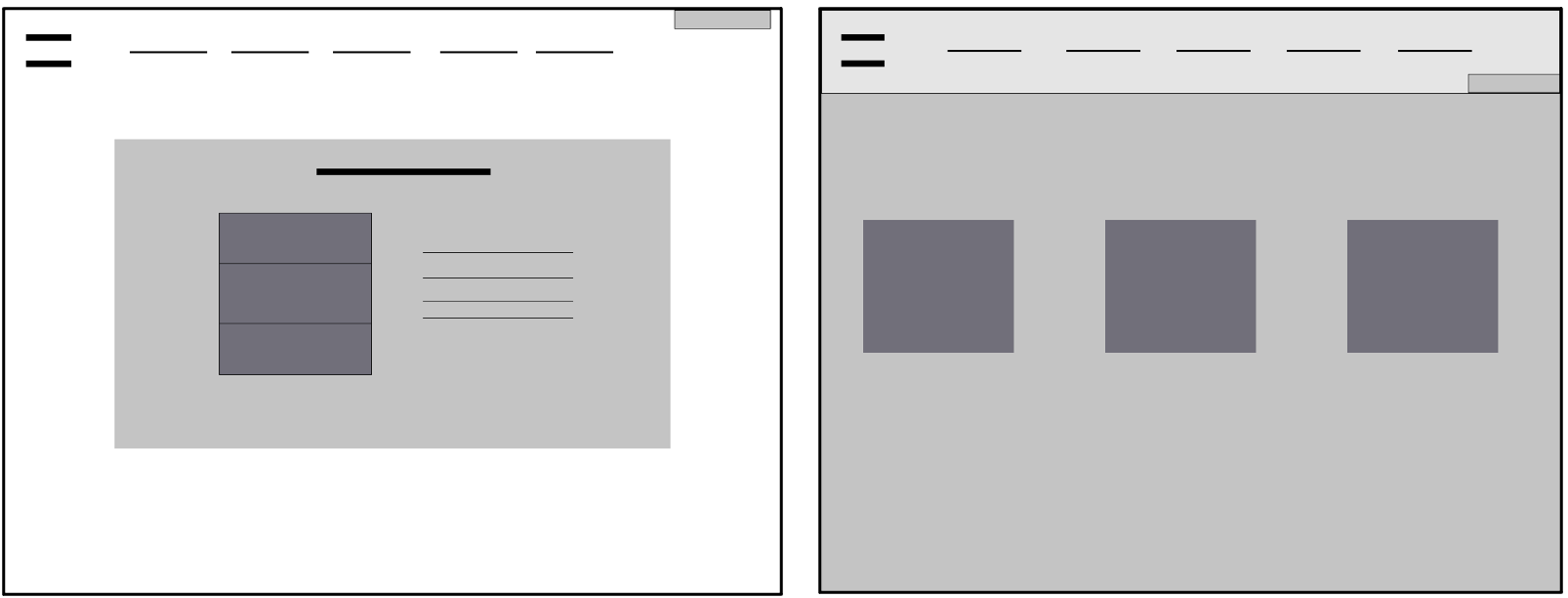
Figure 3 Figure 4
Next I started adding text and other elements to my pages while applying the Gestalt Laws of Proximity, Similarity, and Closure. (Figures 5 & 6)

Figure 5 Figure 6
Logo:
Drawing from inspiration from Gestalt’s law of closure, I created a new logo. (Version 1 - Figure 7) There was nothing inherently wrong with the current Columbia Association logo. However, I wanted to highlight the “CA” abbreviation within the logo because I noticed that they use “CA” across the website to refer to the association despite it being a large part of their brand.
Additionally, I wanted to redo the artwork part of the logo. The current logo is somewhere between a windmill and flower and doesn’t serve a purpose. I decided to create more of a floral design since a lot of the association’s content is nature-based. Logo drafts available in Figures 8 - 10.
Ultimately I decided on the final logo because I wanted to achieve a perfect combination of emphasis on “CA”, simplicity, readability, and scalability (Figure 11)

Figure 7

Figure 8 Figure 9 Figure 10

Figure 11
Color
There isn’t anything necessarily wrong with the current color scheme except for the inconsistency across webpages.
However, I wanted to experiment with colors. I wanted to reuse the current blue/green colors since the association focuses on outdoor activities which led to the monochromatic teal family.
I started with teal monochromatic design in Figure 12 below and found it to be too boring and monotonous. This lead me to experiment with the complementary and split complementary themes. (Figures 13-15)
The monochromatic with complimentary orange color scheme stood out as the best. I removed the tinted overlay I had on the background picture because it muted the colors that could naturally brighten the page.
Towards the end of my re-design process I revisited the color scheme choice. I was concerned about completely changing the brand of the current website and decided to create some versions using the original colors. (Figure 16)
After some deliberations with users, I decided to stick with the re-designed color family. I decided that the colors in the original Columbia Association website weren’t significantly affecting their brand and that the site would benefit from a refresh with a new color scheme.

Figure 12

Figure 13 Figure 14 Figure 15

Figure 16
TYPOgraphy:
The current CA typography doesn’t serve much purpose and is inconsistent across pages.
I started the typography research by looking at serious & government fonts. I landed on a font called Josefin Sans. However, this font was too rigid and the combination with the monochromatic color scheme (before the orange color was added) made the website look too much like a serious government website.
Since the website is for the community, I wanted to give it a playful look and feel. In addition, I wanted to account for the fact that a large part of the site is used for fitness/gym purposes.
I ended up choosing ‘Aleo’ for main headings and ‘Montserrat’ for subheadings, bodies of text and labels.
Layout:
Home Page
I wanted to honor all the content that the original website has on the home page with the additional element of a today’s events section. I retained the carousel of current events and promotions that they have on the home page.
The original website home page has three sections they chose to highlight i.e. ‘Featured Facilities’, ‘Memberships’, and ‘Class & Schedule’. I chose to retain these but reorganize them
Memberships Page
Currently they have membership information displayed in a list which doesn’t give users the ability to compare membership plans. I drew inspiration from the Apple phone model comparison page and decided to create a formal table with three drop down menu options for users to choose three membership plans and compare. The left side of the table included perks in each membership plan and the check mark within the table indicates if the selected membership plan includes the perk.
Golf Page
The current Golf page is complex and disorganized with paragraphs of information everywhere. The re-design provided different categories to be selected within the tri-section menu. When a category is selected, the resulting text paragraph is populated on the right.
Events Page
I wanted to create a simpler design for the Events page. For simplicity, I decided to include only a current day’s events. I included the current weeks’ dates at the top so that users could toggle between each of those dates to view the events on that particular date.
Since users may want to view next or previous week’s events, I added arrows on either side of the calendar. For the more conventional users, I decided to include a ‘Month View’ for them to see a classic calendar view. Additionally, I included a filter for users to find events based on certain criteria.
Overall
I wanted all the pages to have a uniform look and feel so I included a white colored header and a teal colored footer on each page. All pages except the home page have a teal colored banner at the top of the page for consistency.


